
Seven do’s and don’ts for a landing page your customers cannot refuse
The landing page is one of the most important aspects of your marketing and sales campaign. Without a fortunate, high-converting landing page, you might as well spend your money on something more useful. But making a good and appealing landing page can be very tricky. During the last years, we made a lot of landing pages, based on these experiences we have made a list with the DO’s and DON’TS which you can use when making your next landing page.

DO make your landing page align with your email offer
If a customer lands on the landing page via an email, they expect to find a similar offer on the landing page. If this is not the case the customer might lose interest or might feel disillusioned, because it is not what they had signed up for. Make the design and the images, as well as the usage of language, align with the email you will send to the customers.

DO minimize information (keep it simple)
It may be enticing to provide the landing page with a surplus of information about all the benefits. But customers don’t want to spend 10 minutes reading all the information. It is way more effective when you only name the most meaningful features and benefits of the product or service. This also makes it easier for customers to preserve the information given. Keep it simple and clear.

DO make the landing page personal
One of the most important aspects when making a landing page is to make the page personal. Never forget this! When the customer lands on a personal landing page he or she feels involved with the company. They will be more likely to convert to a deal when the customer is personally addressed as Dear Jack instead of the impersonal Dear Mr/Ms salutation. Try the personal tags that you can insert very easy when making a campaign with SlashLead.

DO use strong Calls-to-Action
A call-to-action (CTA) is the button that proceeds the customer to a conversion. CTA’s can be the difference between a conversion and a bounce. So you should use one that is convincing and compelling enough to close the deal. For example, don’t use a standard CTA like “submit” but use one like “get started” or “follow the magic”. With SlashLead you can put anything on the CTA button so be creative! It is also very important to place the CTA button above the fold. Which means that the CTA button is directly visible and the customer doesn’t need to scroll down to see the CTA button.
DON’T use confusing jargon
Make sure that your landing page is easy to understand and doesn’t consist of difficult terms or jargon. Don’t try to impress your customers with fancy, industry-related language because most of the time it leads to confusing your customers and losing leads.

DON’T place distracting links on the landing page
A landing page its purpose is to close the deal with a customer. When a customer lands on the landing page and sees confusing links to social media, the company’s website or an email address he or she might be very distracted by these links and forgets why he or she came on the landing page in the first place thus losing a deal.
DO use appropriate images
Don’t use the first stock images that you can find to fill up space. The images that you use on the landing page should strengthen the message and the value of the product or service you are selling.
Related Posts
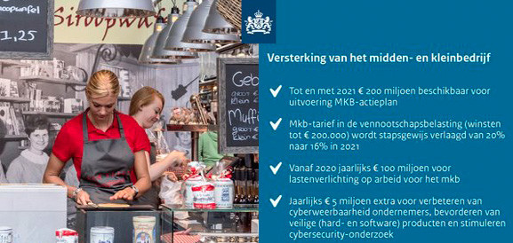
200 miljoen beschikbaar voor MKB
Prinsjesdag is een feit. Het gaat goed met onze economie!
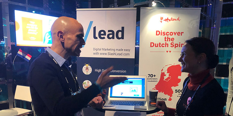
‘What is SlashLead? ‘Interview with Founder Fabian Stenger
Companies embrace new customers with open arms (and often with gifts, too). But once they are 'in', this focus often rapidly wanes due to lack of both [...]